

Your forecast is only as good as your data. Before building a model in Power BI, you must clean your source data. This first step is the most critical part of the process. If you get it wrong, the forecast will be wrong.
Prepare Your Data for an Accurate Forecast
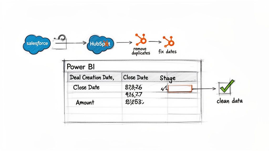
First, connect Power BI to your sales data. Most teams store this data in a CRM like Salesforce or HubSpot. Power BI has native connectors that make this connection simple. However, raw CRM data is rarely clean enough for forecasting.
You will use Power Query, Power BI’s data transformation tool, to clean the data. Think of Power Query as a data workshop. Here, you will shape and polish raw numbers before they enter your data model. This work ensures that every calculation rests on a solid foundation.
The Power Query Cleaning Process
Use Power Query to create a pre-flight checklist for your data. This is where you find and fix inconsistencies that can ruin a forecast. For example, some deals may have missing close dates. Sales reps might use different names for the same sales stage, like "Closed Won" versus "Won."
These small differences can break your calculations. In Power Query, you can set up rules to standardize values. You can also fill in missing dates and ensure every column has the correct data type. This creates a repeatable process that cleans your data every time you refresh it.
Practical Tip: Spend extra time in Power Query to clean null values and standardize text. An hour spent here can save you days of troubleshooting later when your numbers do not add up.
Essential Data Points for Sales Forecasting
To build a useful forecast, pull specific fields from your opportunity or deal records. These are the required fields:
Deal Creation Date: When the opportunity was created.
Expected Close Date: When the rep expects it to close.
Actual Close Date: For historical deals, when it closed.
Deal Stage: Its position in your sales process (e.g., Prospecting, Negotiation, Closed Won).
Deal Amount: The potential or actual revenue.
This checklist outlines the key fields and their common cleaning tasks.
CRM Data Preparation Checklist
Data Field | Importance | Common Cleaning Task |
|---|---|---|
Deal Creation Date | High | Ensure all entries are valid dates. Remove text or null values. |
Expected Close Date | Critical | Fill missing values with a logical default or flag them for review. |
Actual Close Date | High | Standardize the date format. Check for future dates on closed deals. |
Deal Stage | Critical | Standardize naming (e.g., merge "Won" and "Closed Won"). |
Deal Amount | Critical | Convert to a number format. Handle multiple currencies if needed. |
Owner/Sales Rep | Medium | Clean up names and ensure consistency for rep-level reports. |
Product/Service | Medium | Group similar product names. Standardize categories. |
Following this checklist helps make your data model a reliable source of truth.
This level of data preparation is standard practice. The global business intelligence market is on track to surpass USD 5 billion by 2030, with over 40,000 Brazilian companies using Power BI for decision-making.
Once your data is clean, your forecasts in Power BI will be more accurate. If you also need to measure sales health, learn how to calculate Net Dollar Retention, another metric that depends on clean CRM data.
Use Power BI’s Built-In Forecasting Tools
With clean and structured CRM data, you can build your first forecast. You can do this directly inside Power BI without other applications or code.
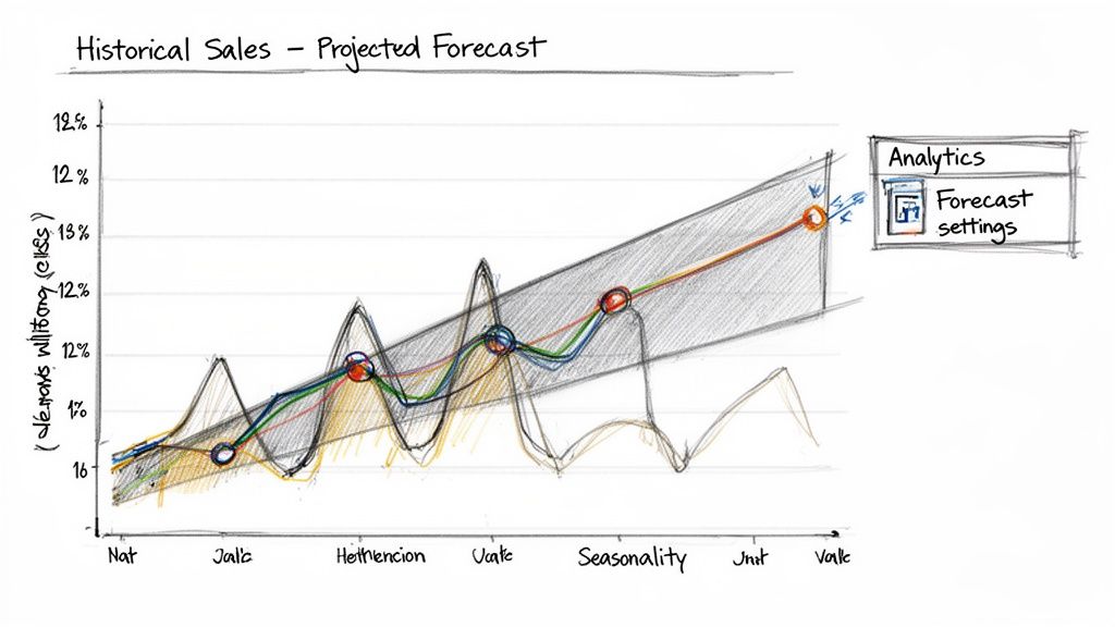
Power BI's native forecasting feature is in the Analytics pane. It provides a quick, data-driven look into the future. The tool uses an algorithm called Exponential Smoothing. This method analyzes your historical data to find trends and seasonal patterns, then projects them forward. It is a good way to get a baseline forecast running quickly.
Apply a Forecast to Your Sales Data
First, create a simple line chart. A good start is to plot your total closed-won revenue by month for the last three years. This chart will be the base for your forecast.
Select the line chart and find the Analytics pane in the Visualizations area. It looks like a magnifying glass. Click it, find the "Forecast" option, and turn it on. A projection will appear on your chart.
Practical Tip: Do not try to forecast with too little data. The algorithm needs sufficient history to find reliable patterns. Use at least two full sales cycles, such as two years of monthly data, for a dependable result.
Configure Your Forecast Settings
Enabling the forecast is the first step. Power BI provides several controls to fine-tune the projection. These settings help align the model with your business's rhythm.
Here is an example setup for a SaaS company forecasting quarterly revenue:
Forecast length: To project revenue for the next four quarters, set this to "4" points.
Ignore last: This feature is very useful. If the current quarter is in progress, you can exclude it from the calculation to avoid skewing the trend. For example, if it is mid-February and you have monthly data, ignore the last "1" point.
Confidence interval: This is crucial for managing expectations. A 95% confidence interval provides a range where you can be 95% confident the actual results will fall. It helps you communicate uncertainty and avoid over-promising.
Seasonality: If your business has predictable peaks, you must inform the model. For quarterly data with an annual cycle, input "4" points to define the seasonal pattern.
The use of these tools is widespread. For example, Brazil is the second-largest source of Power BI web traffic, with 12.64% of users worldwide. This indicates how many professionals use these features for business strategy. You can find more global Power BI usage statistics for a complete picture.
By adjusting these parameters, you can turn a basic line chart into a useful forecasting tool. This provides a solid, statistically grounded baseline without leaving the Power BI interface.
Advance Your Forecasts with Custom Models
Power BI’s built-in forecasting tool is a great starting point. It is fast and provides a solid baseline. But what if your sales patterns are more complex than a simple trend line?
You may face erratic sales cycles or need to incorporate external factors like marketing campaigns or economic shifts. When the standard model is not enough, you can use custom models.
Integrating R or Python scripts into Power BI provides more statistical depth. This lets you build a forecasting Power BI model that reflects the specific dynamics of your business.
When to Use a Custom Script
Moving to R or Python is a strategic decision for when your data requires more sophistication. Consider a custom script when:
You need to include external factors. For example, you want the forecast to react to changes in ad spend or predict the impact of a product launch.
Your sales data has complex seasonality. A custom model can handle overlapping patterns, like quarterly spikes combined with a large year-end rush.
Your growth is not linear. If your sales follow an S-curve or another non-linear path, a custom model can capture this nuance more accurately.
Practical Tip: Custom scripts give you control. You are no longer using a "black box." You can choose the exact statistical method, such as ARIMA or Prophet, that best fits your historical data and business logic.
Comparing Native vs. Custom Forecasting
This table compares Power BI's built-in tools with advanced methods. The right choice depends on your needs and resources.
Forecasting Method Comparison
Method | Complexity | Best For | Key Advantage |
|---|---|---|---|
Power BI Native | Low | Quick trend analysis, stable sales cycles, baseline forecasts. | Speed and simplicity. No coding is required. |
R / Python Script | Medium | Complex seasonality, external variables, non-linear trends. | Flexibility and statistical control. |
Azure ML | High | Large datasets, automated model training, operational models. | Scalability and enterprise-grade machine learning. |
Native tools are excellent for starting, but custom scripts offer the precision needed for complex business environments.
Integrate a Python Model into Power BI
Let's review a practical example. Suppose you want to use an ARIMA (AutoRegressive Integrated Moving Average) model for a time-series forecast. The workflow involves sending data from Power BI to a Python script, running the model, and bringing the results back into your report.
First, install Python and the necessary libraries like pandas and statsmodels on your computer. Configure Power BI to find your Python installation in the settings.
Once set up, follow these steps in Power Query:
Prepare Your Data: Start with a clean table of historical monthly sales with two columns:
DateandSales.Run the Python Script: Go to the "Transform" tab in Power Query and click "Run Python script." This opens an editor for your code.
Execute the Model: The script takes the data from Power BI, runs the ARIMA model to predict future values, and puts the predictions into a new DataFrame.
Retrieve the Forecast: The script returns the forecast table to Power Query. You can then merge it with your original data and build visuals.
This type of integrated analytics is a feature of modern data-driven businesses. While cloud adoption is a major factor, regional differences exist. Latin America's adoption rate is 39%, compared to North America's 87%. This gap presents an opportunity for companies to gain an edge by using cloud analytics solutions like Power BI with custom scripts. You can read more about trends in the global business intelligence market.
By integrating custom scripts, you turn your forecasting Power BI report from a historical record into a predictive tool. This requires more upfront effort but provides more accurate and realistic models. If you also need to track customer retention, our guide on calculating the revenue churn rate is a useful next step.
Visualize Forecasts for Clear Decision-Making
A statistically sound forecast is only useful if managers and executives can understand and act on it. Visualization turns complex models into clear, actionable insights.
A good forecasting Power BI dashboard tells a story about where the business is headed. The goal is to create an interactive experience that allows leaders to explore scenarios, compare options, and make informed decisions.
This diagram shows how Power BI can work with tools like Python for advanced forecasting. The workflow involves preparing data in Power BI, sending it to an external script for modeling, and bringing the results back for visualization.
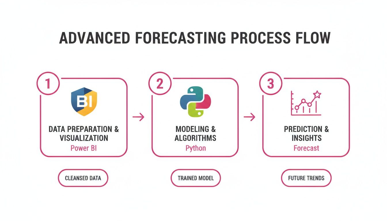
This process allows you to use sophisticated statistical libraries with Power BI's visualization engine.
Build Intuitive Forecast Visuals
A combination chart is often the most effective visual. It can show historical actuals as columns and forecasted revenue as a line. It is crucial to also include the upper and lower confidence bounds. This single visual communicates the most likely outcome and the plausible range of possibilities.
Another effective technique is to overlay sales quotas or targets as a constant line on the same chart. This adds immediate context. It allows anyone to see if the forecast is on track to meet goals. This simple addition changes a report into a strategic planning tool.
Practical Tip: Do not present the forecast as a single number. Always visualize the confidence interval. This helps manage expectations and frames the forecast as a probabilistic guide, not a guarantee, which builds credibility with leadership.
Make Your Dashboard Interactive and Actionable
Static charts are good, but interactive dashboards drive engagement. Empower users to analyze the forecast data in ways that are relevant to their roles.
Implement Slicers: Add slicers for dimensions like sales region, product line, or individual sales reps. This lets a regional manager see their team's forecast without needing a separate report.
Measure Forecast Accuracy: Build trust through transparency. Use DAX measures to calculate and display accuracy metrics like Mean Absolute Error (MAE) on the dashboard. This shows you are tracking performance and refining the model.
Compare Against Performance: Provide visuals that compare the forecast to quotas and to performance from the same period last year. This helps identify true growth and separates seasonal effects from business trends.
By including these elements, you create a dynamic dashboard that is more than a simple prediction. It becomes a central hub for strategic sales conversations, helping managers allocate resources, identify risks, and coach their teams. This makes the forecasting Power BI report an essential tool for driving business performance.
Put Your Sales Forecast into Action
A forecast is useless if it is not used. The final step is to share your dashboard with the people who need it. This is where your work on data cleaning and modeling delivers business value.
Make your forecast an essential part of business conversations. It should be the go-to resource for pipeline reviews, territory planning, and performance discussions.
Publish and Automate Your Forecast
First, move your report from Power BI Desktop to the Power BI Service. This is the cloud-based platform for sharing, security, and automation.
Once published, set up automated data refreshes. This is a mandatory step. A stale forecast is a misleading one. Configure it to connect to your CRM and pull the latest deal data multiple times a day. This ensures your forecast reflects current activity.
Practical Tip: A forecast should be a living document, not a one-off report. A daily refresh, at minimum, turns your dashboard into a reliable source of truth.
Share the report, but control who sees what. You likely do not want every sales rep to see the entire company's pipeline. Use Row-Level Security (RLS) to manage access.
Set up roles: In your Power BI data model, create roles like "Sales Manager" or "Sales Rep."
Filter the data: For the "Sales Rep" role, write a DAX filter that shows data only where the deal owner's email matches the logged-in user's email.
Assign people to roles: In the Power BI Service, assign team members to these roles. They will then only see data relevant to them.
Push Insights to Your Team with Alerts
A good dashboard should actively notify you of important changes. Power BI has features for this.
Subscriptions are useful for keeping people informed. You can set up an email subscription to send a snapshot of the forecast to all sales managers every Monday morning. The November 2025 Power BI update is expected to enhance this by allowing Copilot to automatically add a summary of key insights to these emails.
For urgent matters, use data alerts. For example, you can set an alert on a KPI card that tracks "Forecast vs. Quota." If the forecast drops below 90% of the quarterly target, an alert is triggered, sending a notification to the sales director.
This changes your dashboard from a passive report into an active monitor. It flags significant changes immediately, allowing leaders to make timely decisions. This is a critical part of any effective revenue growth management strategy.
Frequently Asked Questions About Power BI Forecasting
As you build your sales forecasts, you may encounter common challenges. This section addresses frequent questions from teams working on forecasting Power BI projects.
Use this as a guide for troubleshooting and making better decisions as you develop your forecasting process.
How Much Historical Data Do I Need?
The answer depends on your business, but more data is usually better. Power BI’s built-in tools need enough data to identify trends and seasonality.
Aim for at least two full business cycles.
For yearly seasonal patterns: You need a minimum of 24 months of data. This gives the model two complete cycles to understand annual peaks and troughs.
For quarterly business cycles: At least 8 to 12 quarters of data is a good starting point.
Using less data is risky. The model might identify random fluctuations as trends, leading to inaccurate predictions.
Practical Tip: Avoid using outdated data. If your business model changed a year ago, use only the most recent year of relevant data instead of five years of data that no longer reflects your current operations.
What is the Best Way to Handle Outliers?
Outliers can distort your forecast. A single, unusually large deal can make the model project unrealistic growth. You have two practical ways to handle this.
The simple approach is to remove the outlier from the dataset used for forecasting. You can do this in Power Query by filtering out the specific deal. A more advanced method is to "cap" the value. For example, create a conditional column in Power Query that changes any deal over £500k to £500k. This keeps the deal in your data but reduces its effect on the forecast.
Should I Use DAX or a Custom Script?
The choice between DAX and a custom script like Python or R depends on your goal and your team's skills.
Use DAX when: You are calculating forecast accuracy metrics like Mean Absolute Error (MAE) or building simple "what-if" scenarios. DAX is part of your Power BI model, making it fast and efficient for these tasks.
Use a custom script (Python/R) when: You need to include external factors like marketing spend or economic indicators. If your sales patterns are too complex for standard models, a script provides access to advanced statistical techniques that DAX does not offer.
How Can I Improve My Forecasts Over Time?
Accurate forecasting is a continuous process of refinement.
Track Your Accuracy: Constantly compare your forecasts to actual results. Use DAX to calculate the variance and display it on your dashboard.
Talk to Your Sales Reps: Your sales team has insights that data alone cannot provide. They know if a major deal might slip to the next quarter or if an account is at risk.
Iterate and Refine: Use accuracy metrics and feedback from your team to tweak your model. This could mean adjusting seasonality settings, improving data cleaning, or moving to a more advanced forecasting method.
An accurate forecast is a powerful tool. By addressing these common issues, you can build a more robust, reliable, and useful forecasting process in Power BI that supports better decision-making.
Samskit turns customer meetings into reliable CRM updates and clear next steps. By automatically recording, transcribing, and analysing sales calls, Samskit eliminates manual data entry and provides managers with unparalleled visibility into deal health. Give your sellers more time to sell and build forecasts you can actually trust. Learn more and get started at https://samskit.com.